Artsy Tableau Visualizations
It happens every now and that that, through just playing around with Tableau, I get some interesting visualizations. To be honest, most of the times this happens I’m just throwing metrics and dimensions around like rice on a wedding. In other words, don’t ask me to redo these, because I have no idea how I got there in the first place.
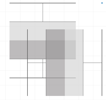
The Picasso
The one that inspired me to start this post. I can’t remember how it came about but I took a screenshot of it and thought, this is art. Sometimes I wondered how it would have been if I added some colour. But then again, see that dot on the top right? It’s blue. :)
It shall be named “the Picasso”